SmartPay
With numerous IDs and payment cards we carry around on a daily basis, it can be difficult for us to keep track of our own information. SmartPay is a digital wallet & payment app that allows users to send/receive money, view investments, and access their crypto wallet — all in one place. Our goal was to understand the way people may currently use different payment apps and ultimately create a trustworthy, easy-to-use mobile app.
-
Team: 5 UX Designers
Role: User Research, Prototyping, UI Design
Tools Used: Figma, Trello, Maze, Google Sheets
Challenge
To create a financial mobile app for users to send and receive fiat/crypto money to other users, cross border transactions, and small business transactions.
Goal
To understand the way people may currently use different payment apps and ultimately create a trustworthy, easy-to-use mobile app.
User Interviews
Our interviews helped us gain multiple perspectives and uncovered the common pain points needed to address with the ShopTaki Pay app. We interviewed 10 people, between the ages of 25-60, and discovered three important insights:
Security Concerns
Possible identity theft, exposure of private information, and uncertainty of protection.
Almost impossible making urgent payments because of long wait times.
Transfer Speed
Transaction Fees
Frustrations with high transaction fees, especially internationally.
Venmo

Competitive Analysis
In order to determine Shoptaki’s position compared to their competitors, we conducted a competitor analysis among three other apps, based on money transfer and cryptocurrency. This helped us to see their strong and weak points, allowing us to come up with solutions to current problems.
-
Users can setup their profile as a personal or business account.
The QR code feature makes it convenient for users to send or receive money.
Money transfers take 1-3 business days with no fee.
-
Some users tend to not like the social aspect of the app, mainly because they do not wish to make their transactions public.
Wise
-
This is a popular option for users who make frequent international transactions.
A breakdown of fees is provided for transparency and to allow users to compare fees among other apps.
-
There is no option to allow for automatic recurring payments.
Conversion rates must be entered in manually, becoming an extra step users must take.
Ledger
-
The great visual data representations of assets can be a great way for users to securely view all their cryptocurrencies and buy, sell, or trade crypto.
-
Users are unable to send or receive money to/from others.
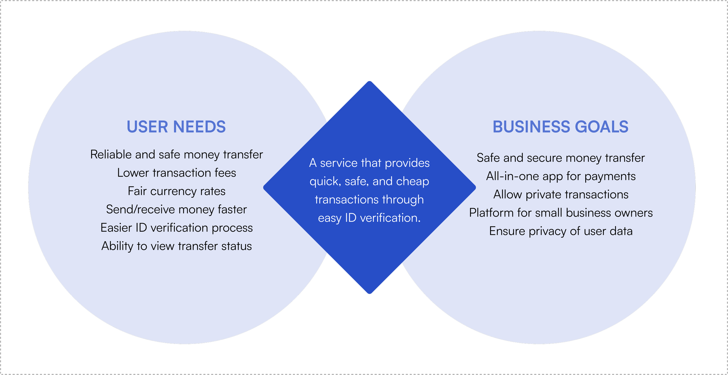
User vs. Business Needs
An important aspect we had to consider was not only the needs of the users, but the needs of the business as well. After discovering the needs and pain points of the users, we switched our viewpoints to the business perspective in order to see the commonality of the two. From there, we were able to obtain a better understanding of what needed to be integrated into the app.
Problem Statement
Users feel overwhelmed and uneasy about sharing their sensitive financial information online, paying high transaction fees, as well as dealing with slow payment methods.
Initial User Flows
During our ideation phase, we brainstormed the different types of information as well as the steps users would need to take in order to successfully send and request money. By empathizing with users, we were able to create a user flow that would allow them to send money in the most convenient manner.
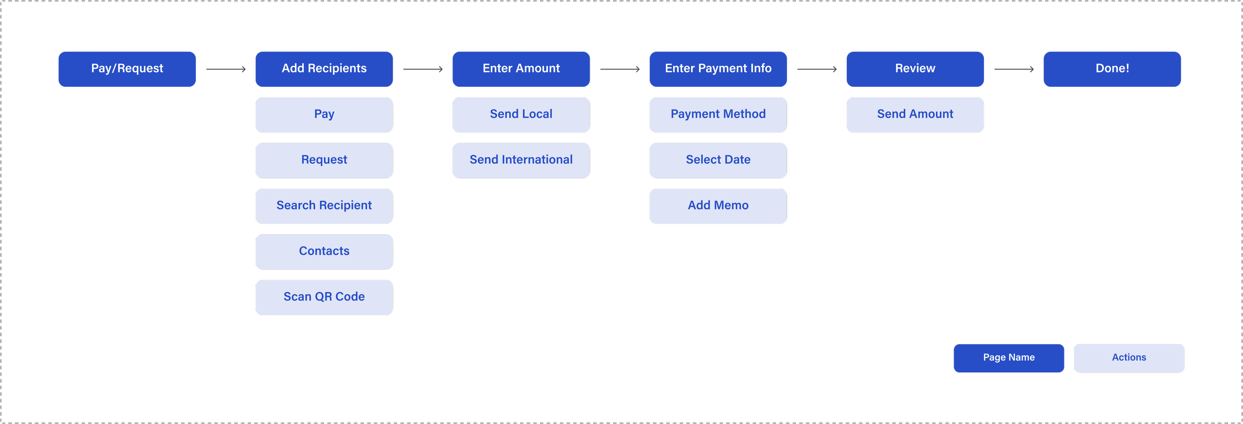
Mid-Fidelity Wireframes
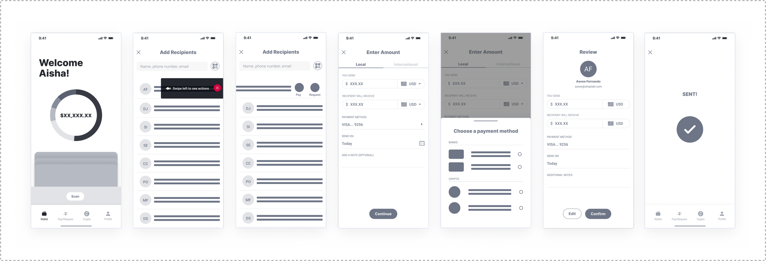
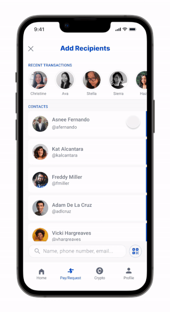
Using our competitive analysis results and our initial user flow, we designed mid-fidelity wireframes to show how users might send or request money through the app. The “Add Recipient” screen prompted users, using a tooltip, to swipe on a recipient of choice to start their pay/request flow.
Final Designs
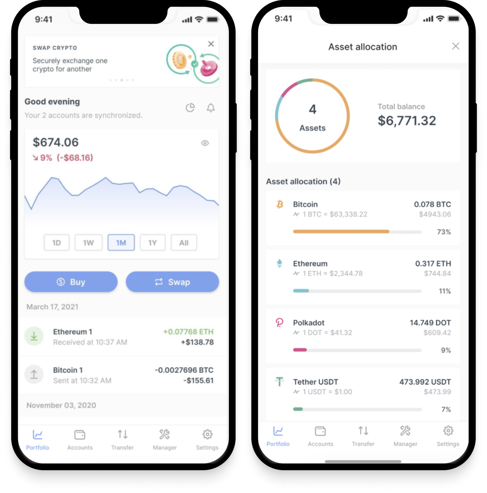
Through observing the behaviors of testers and obtaining feedback for our initial prototype, we were able to make necessary iterations for our final design. Some iterations included changing the “tap and swipe” feature of the payment step to a “tap and tap” function and improving the screens for the payment flow. We also created other features on the digital wallet, taking into account the business goals for a fiat and crypto section of the app as well as a flow for small business owners to track their sales.


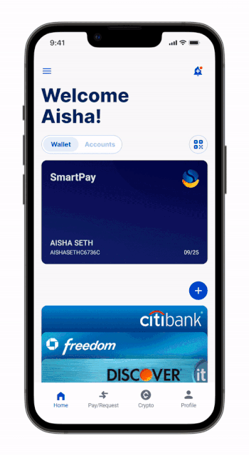
Landing Page
When users first open SmartPay, they are able to view their cards at a glance. Users are also able to easily add in new cards or payment methods into their wallet.
In the Accounts section of the landing page, a wheel with interactive filtering is provided for users to see a breakdown of their accounts as well as their recent transactions.
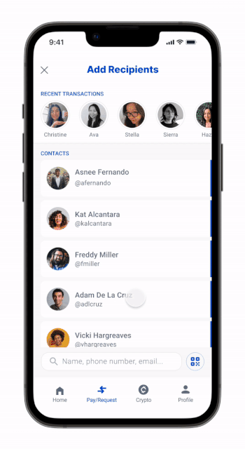
Quick Pay
Inspired by social apps, the quick pay function is a way for users to resend money to those they have made recent transactions with. Additionally, the search bar was placed at the bottom of the screen for users to easily access the function.
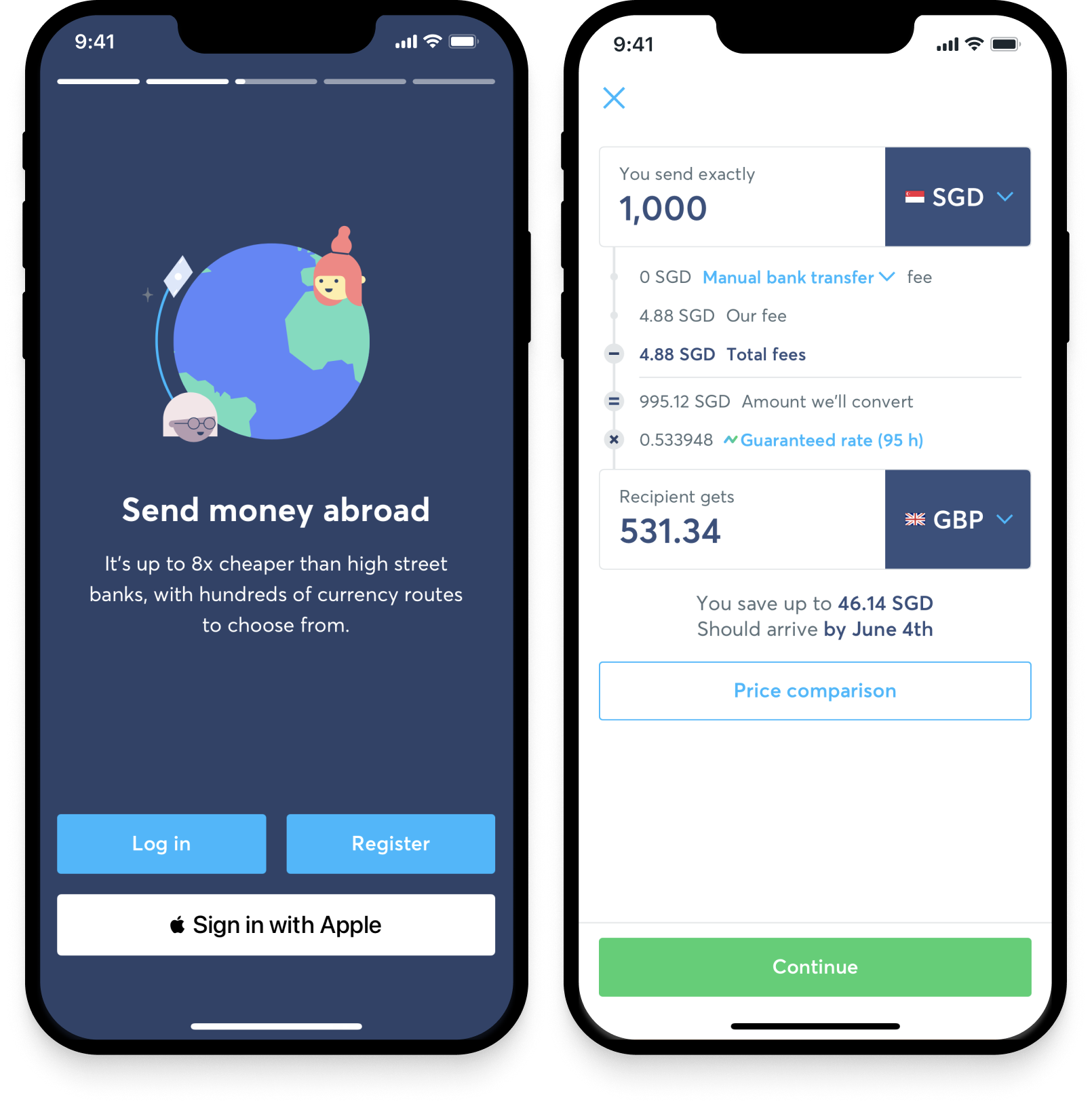
International Pay
Users are able to view a fee breakdown and by implementing this in a drop down, it keeps a clean design as it allows them the freedom to show or hide this information. The recurring payments option provides users with the ability to choose to schedule payments on a timely basis rather than having to go through the hassle of manually sending money.
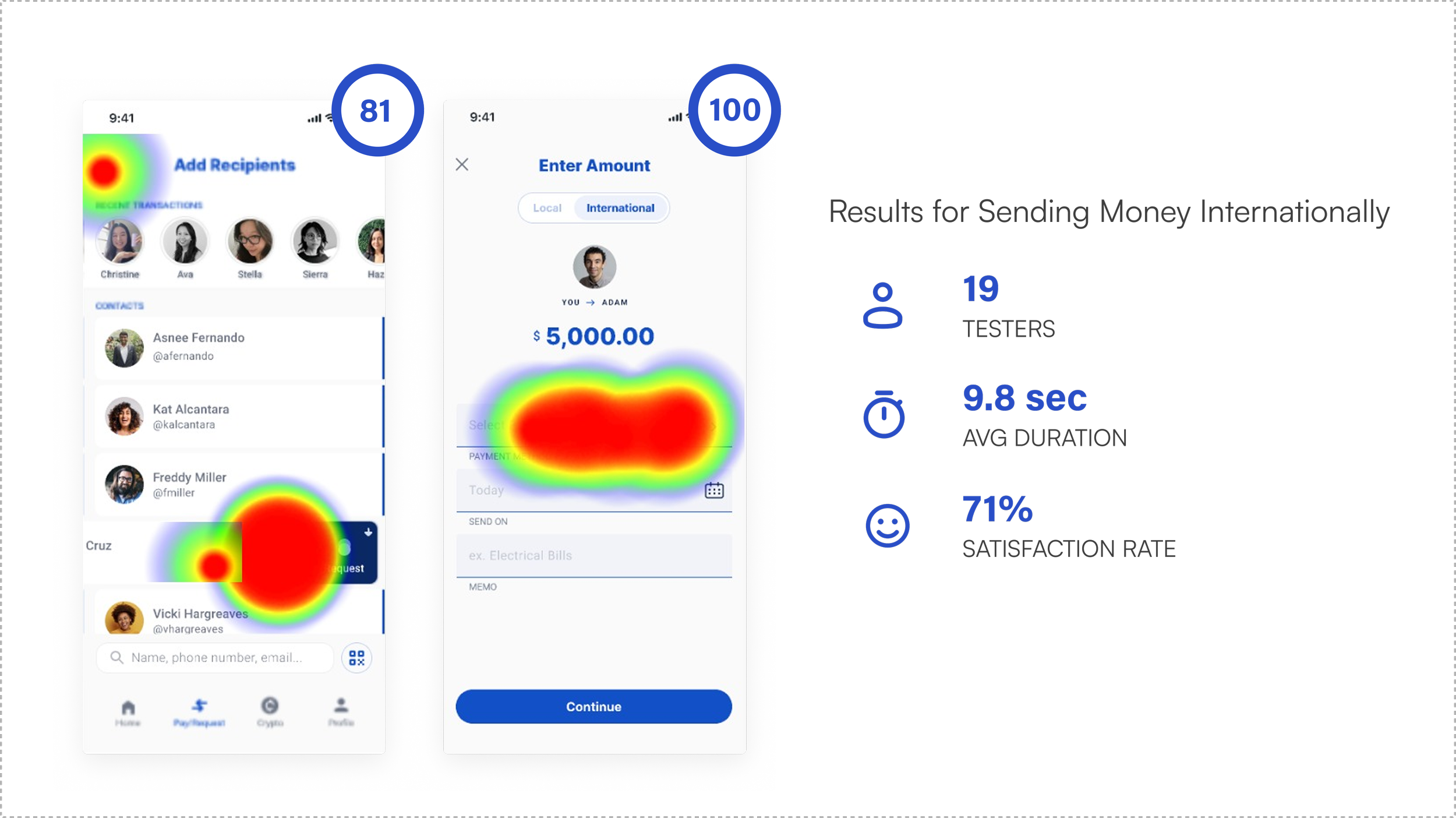
Testing
We conducted our final usability test on the high fidelity prototype and were able to find several important findings using Maze. This included usability scores, heat maps of the different screens, the average duration of the tasks, and the overall satisfaction rate. Our task results were based on a local flow and an international flow for the app, revealing the following information: