
Property Toolbox
Realtors manage numerous properties each year, making it challenging to stay organized and make timely, informed decisions. Property Toolbox is dedicated to revolutionizing the real estate experience through AI-driven reports for buyers and sellers.
-
Team: 2 Designers, 3 Software Engineers
My Role: Research, Design, Branding
Tools Used: Figma, Adobe Illustrator
Challenge
We were tasked with redesigning the beta version of the app. The previous app screens made it difficult for users to process and effectively use the app due to an overall inconsistent structure, disorganized user flows, and cluttered categories. Addressing these issues helped us align the app with both business and user goals, allowing for a seamless and intuitive user journey.
Comparative Analysis
Through research on the current market, we were able to get a better understanding of industry standards and identify opportunities for improvement, given that it was a niche market. We analyzed real estate apps, such as Zillow, Trulia, and Redfin to uncover any insights that would help guide our design decisions.
Seamless registration or sign in process allows users to start their home-buying or selling journey without delay.
Easy Login Flow
Key information for each listing was organized within a card component for effortless scrolling of multiple properties.
Simple Card Components
The property listing screens were structured hierarchically for easy access to key features without overwhelming information.
Property Listings
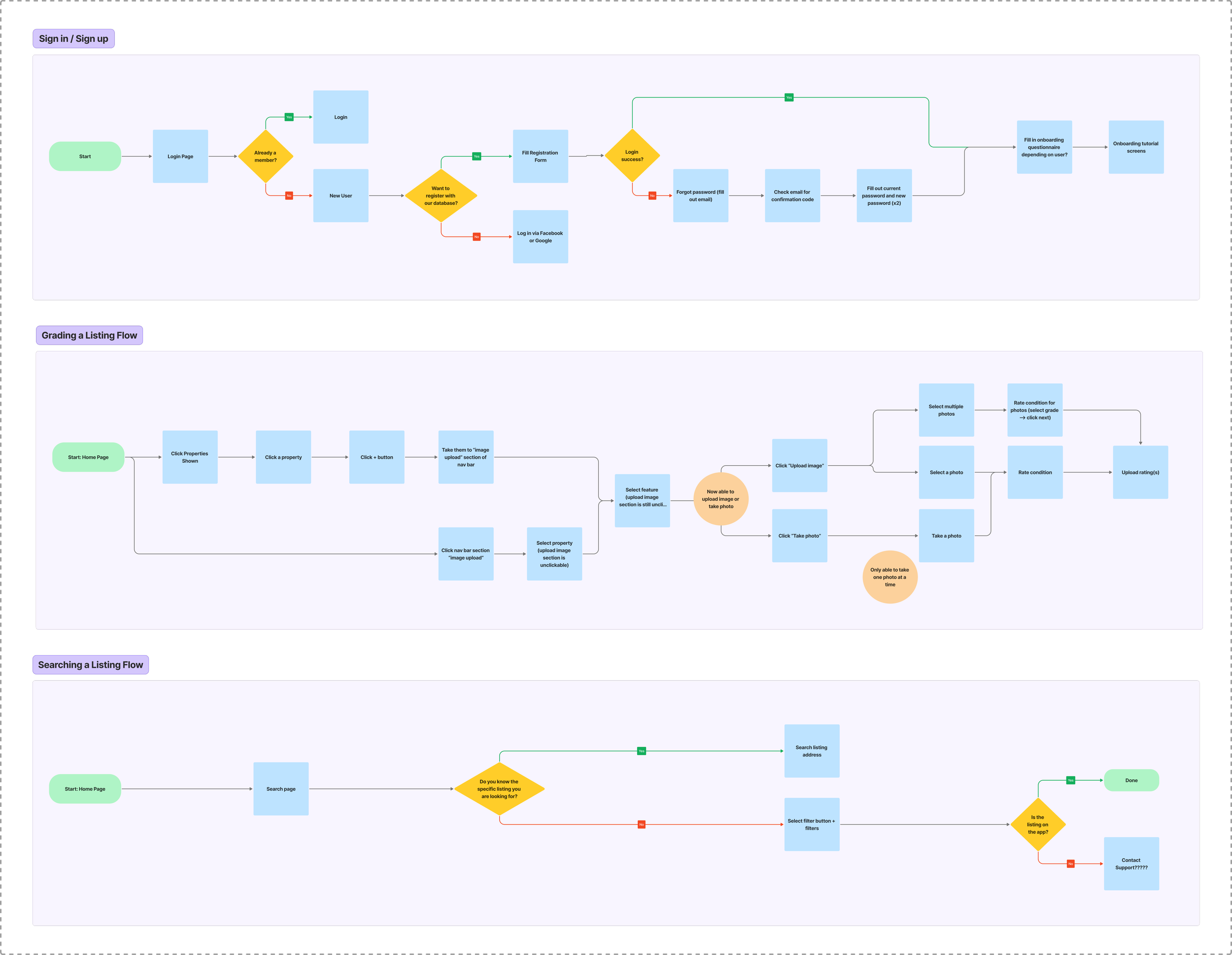
User Flows
After several discussions with both the client and developers, we determined three key flows to work on based on potential user and current business needs.
Information Architecture
The previous information architecture had a confusing layout, making it challenging to understand available features and navigate to different sections of the app without getting lost. Given our previous research, we restructured the IA to create a more intuitive, hierarchical organization of the app’s design.

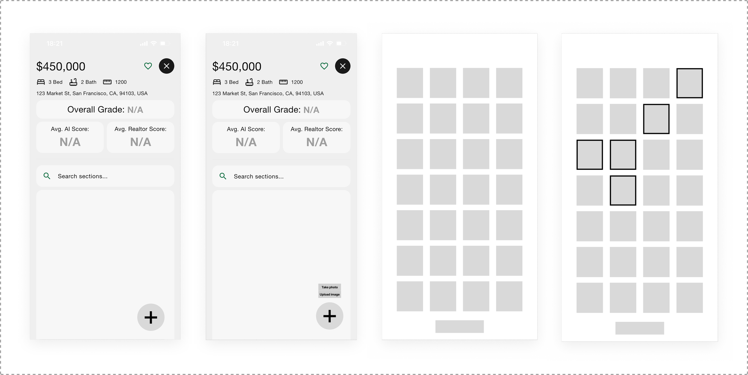
Initial Wireframes
Presenting the initial wireframes to the client helped us to ensure that we were aligned with the business goals and to see if any iterations needed to be made on the main components before designing the remaining flows.
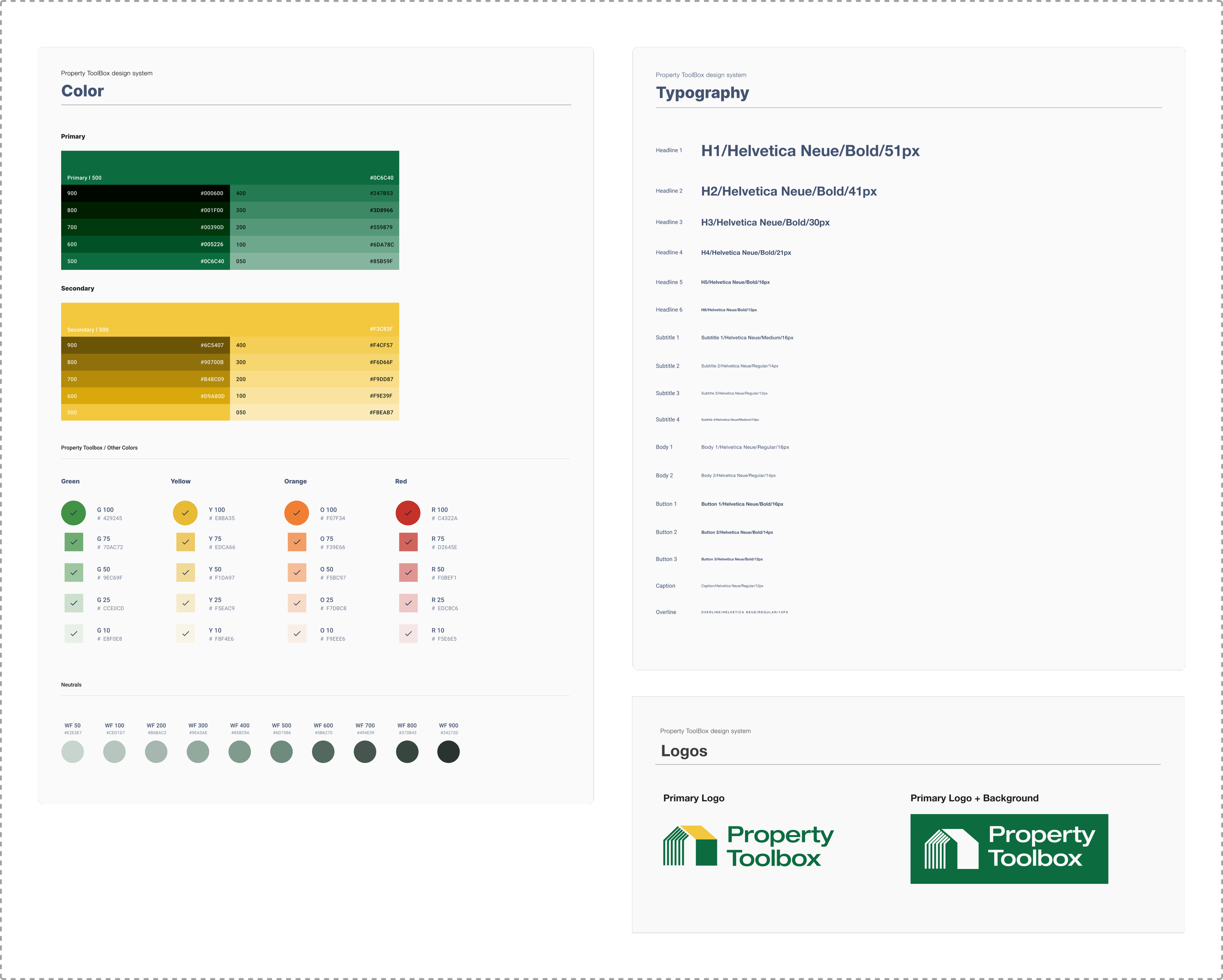
Design System
The app lacked an official design system, with inconsistent HEX shades of green and various font sizes being applied throughout the screens. We developed a comprehensive design system that not only provided a consistent visual language for stakeholders to use in assets but also served as a reference for developers, ensuring streamlined design implementation throughout the app.
Final Designs
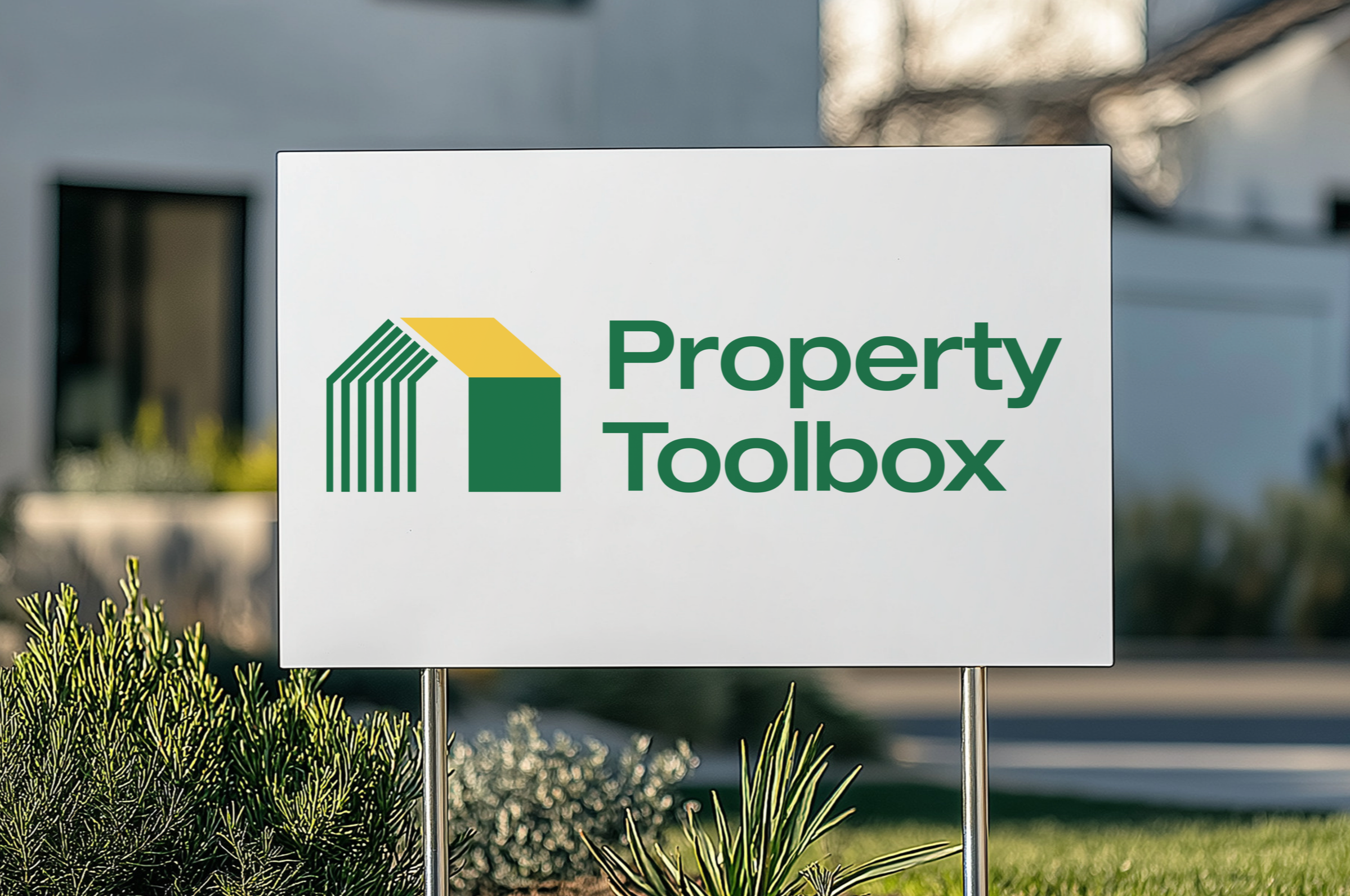
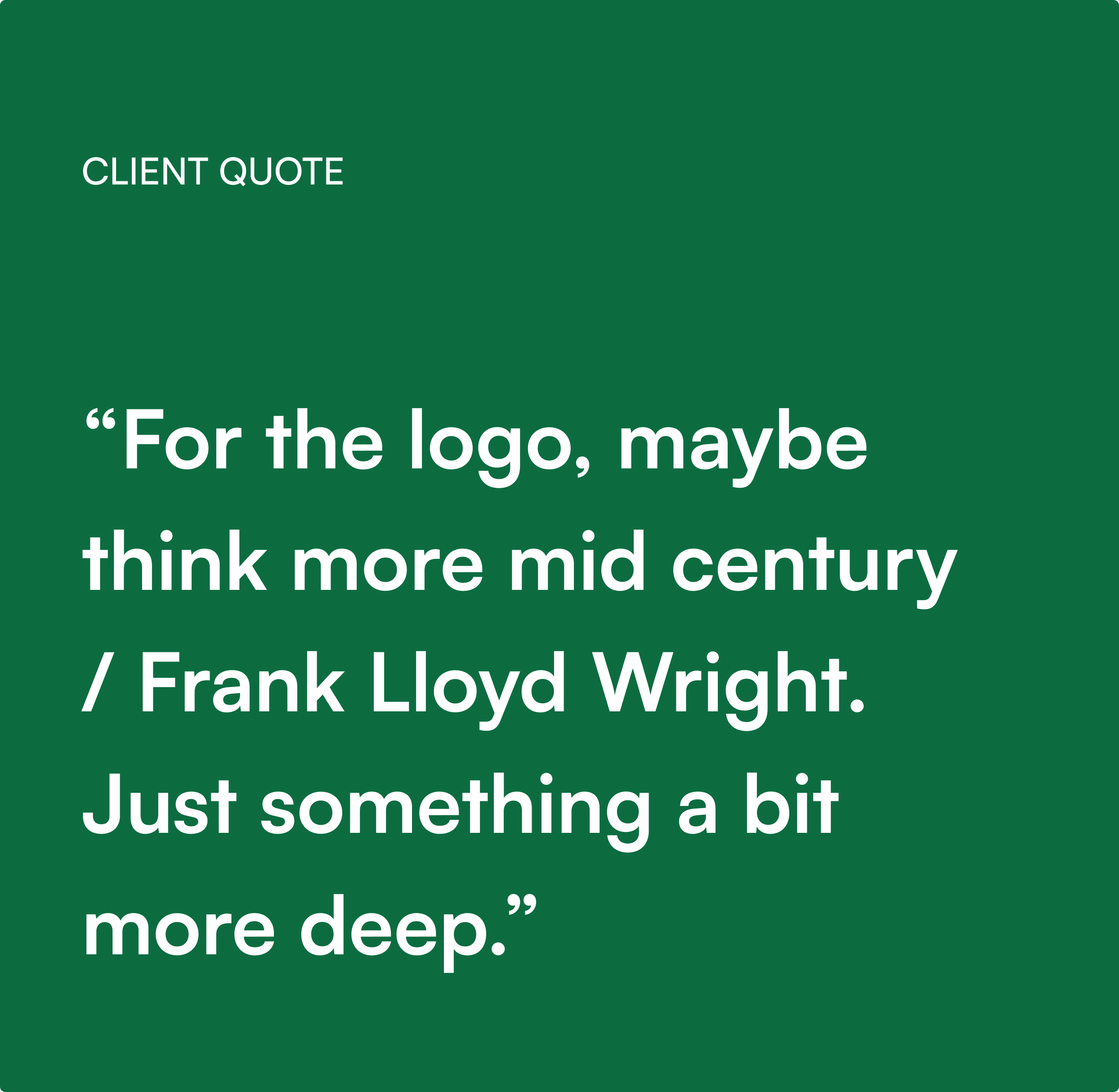
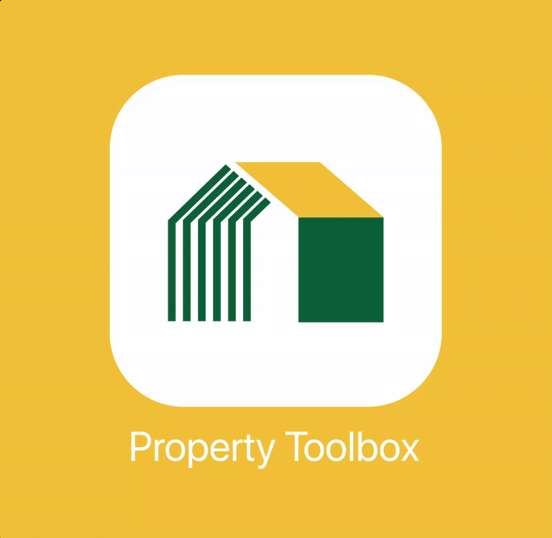
For the logo, the client requested an "architectural icon", so we presented several options, along with color and typography variations, before reaching an agreement on the final design.


Next Steps
If given more time, I would want to work on:
Conducting usability testing with the first few users to see how efficient the AI scanning feature and organization works during their daily work routines.
Conducting usability testing to see how realtors interact with the grading feature using the camera.
Adding more of a friendlier approach through illustrations and animations for the loading, error, and "no properties" screen, replacing the filler logo.