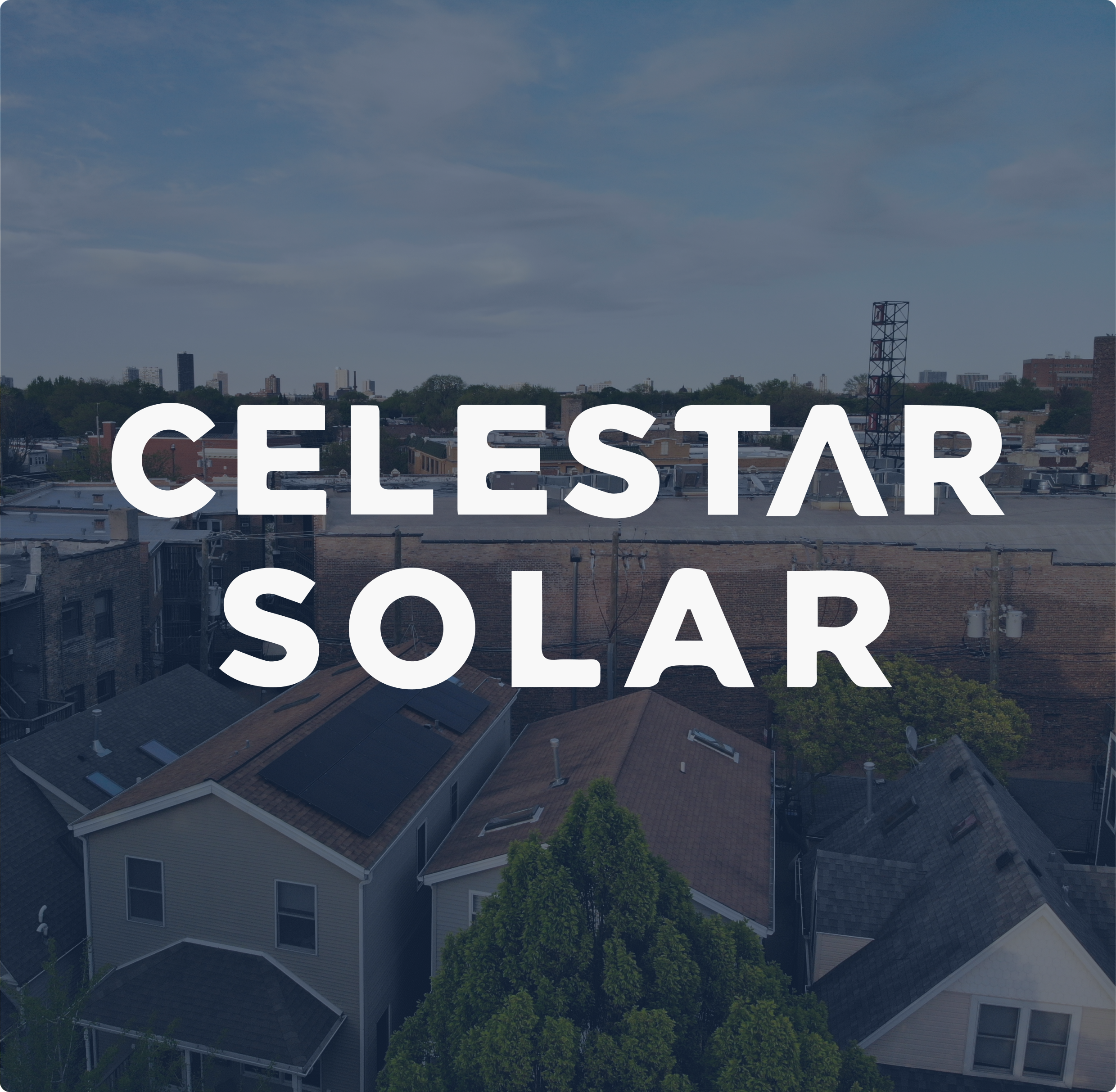
Celestar Solar
Celestar Solar is a Chicago-based solar installation company with a mission focusing on quality over quantity and transparency at all stages. Our goal was to build a functional website that not only shows the fine work ethics of the business owner, but the right and helpful information for customers as well.
-
Team: 3 Researchers, 2 Designers
Role: UI Design
Tools Used: SquareSpace, Figma, Trello, Google SpreadSheets
Challenge
To create a structured, intuitive website that provides users with trustworthy information and allows for an easy way to bring potential customers to the business via search engine optimization.
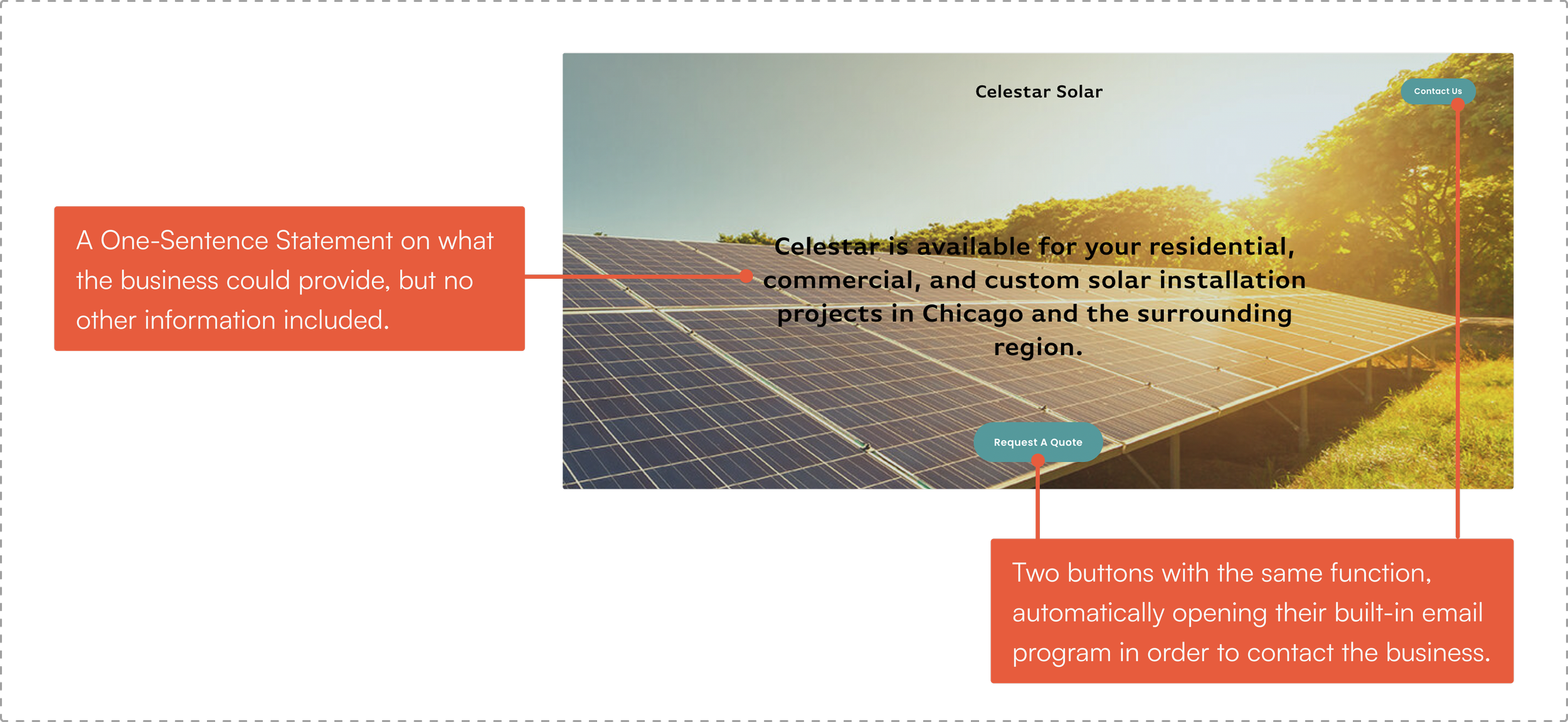
Previous Website
Since its launch, the business has been mainly run by word of mouth and the existing domain consisted of only a background photo along with two main features:
Chicago-Based Company
To show that the business is a community-based, accessible, friendly, and trustworthy company that customers can look to.
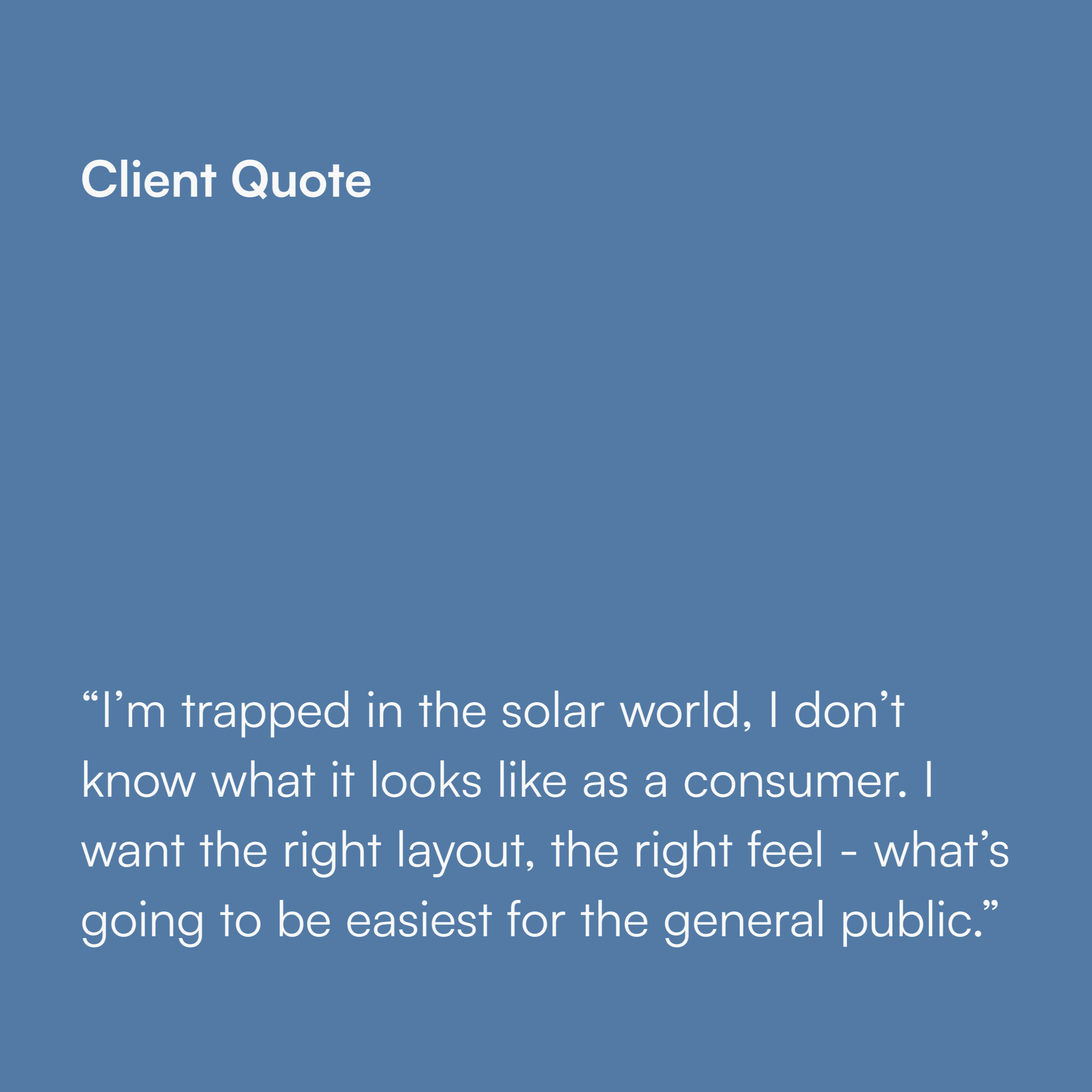
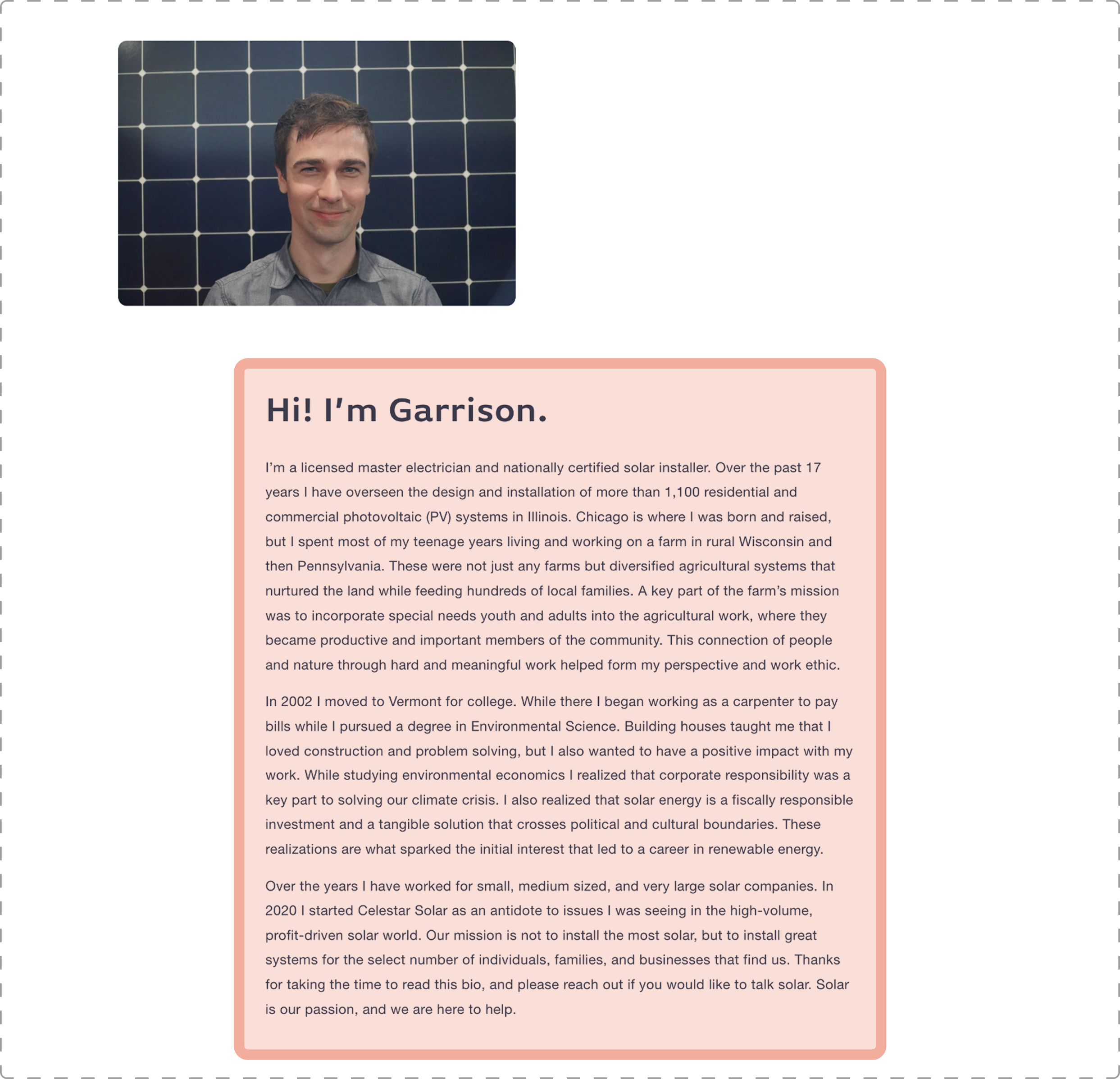
Celestar Solar has been sending individual emails to each potential customer, detailing the company mission, installation steps, product information, tax incentives, and any other relevant information they may need. In addition to these exhausting company resources, this process also makes learning about Celestar cumbersome, time-consuming, and potentially confusing for the consumer.
Market Analysis
We reviewed competitor websites with a similar customer base and business model as Celestar Solar in order to understand the audience. Through this process, we were able to understand the features displayed on the market for solar customers, especially ones that they are already familiar with and utilizing.

Business Goals
During our team meetings with the client, the client had emphasized the following:
To allow people to understand the legitimacy of the business and to feel more comfortable working with the client.
Customer Trust
Clear Information
Provide enough info where customers are interested, but not so much to confuse them and cause barriers to solar that may not actually exist.
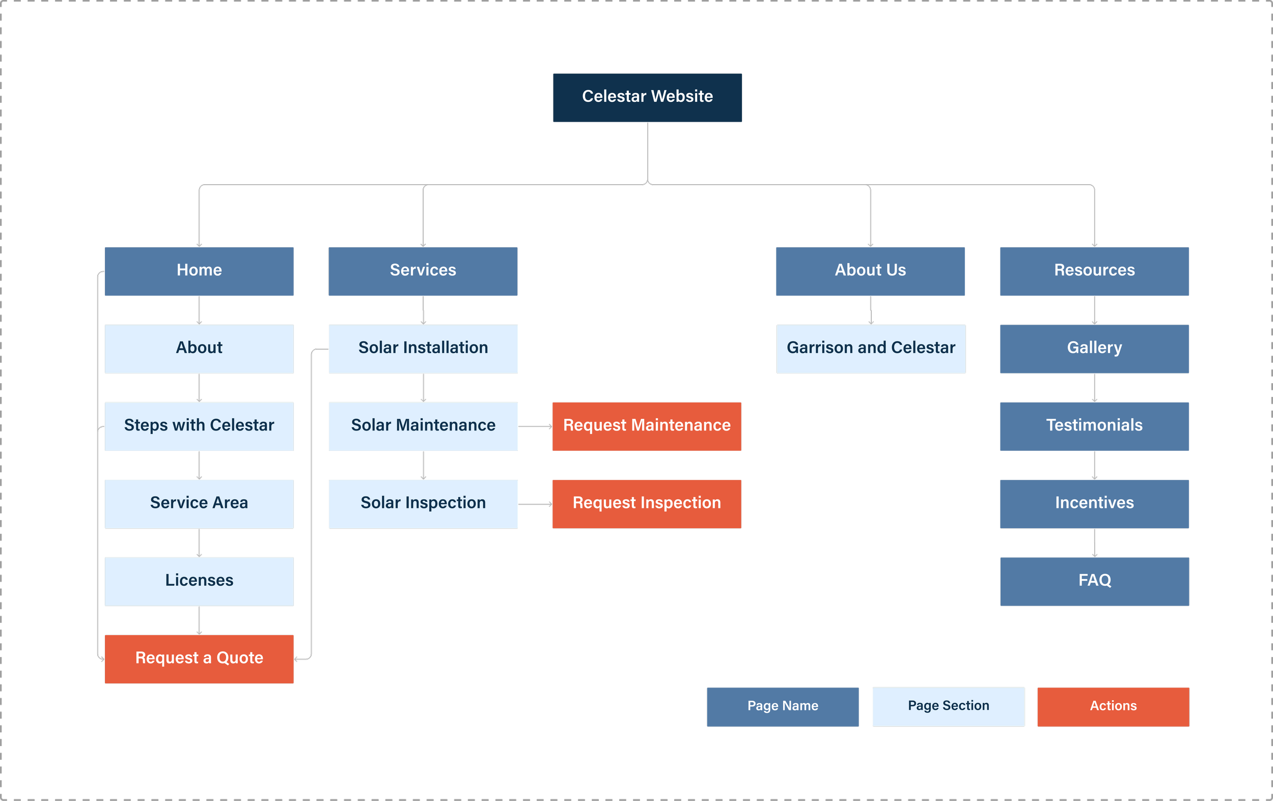
Information Architecture
Based on our research with competitor websites, a site map was created in order to better organize the innumerable amounts of information provided, taking into consideration the business values. This would allow for customers to find the answers to their general solar questions in an efficient way without the hassle of having to read through the long emails.
Problem Statement
The current website does not provide any information regarding solar, making it difficult for customers to easily find out about the company and what services they provide.
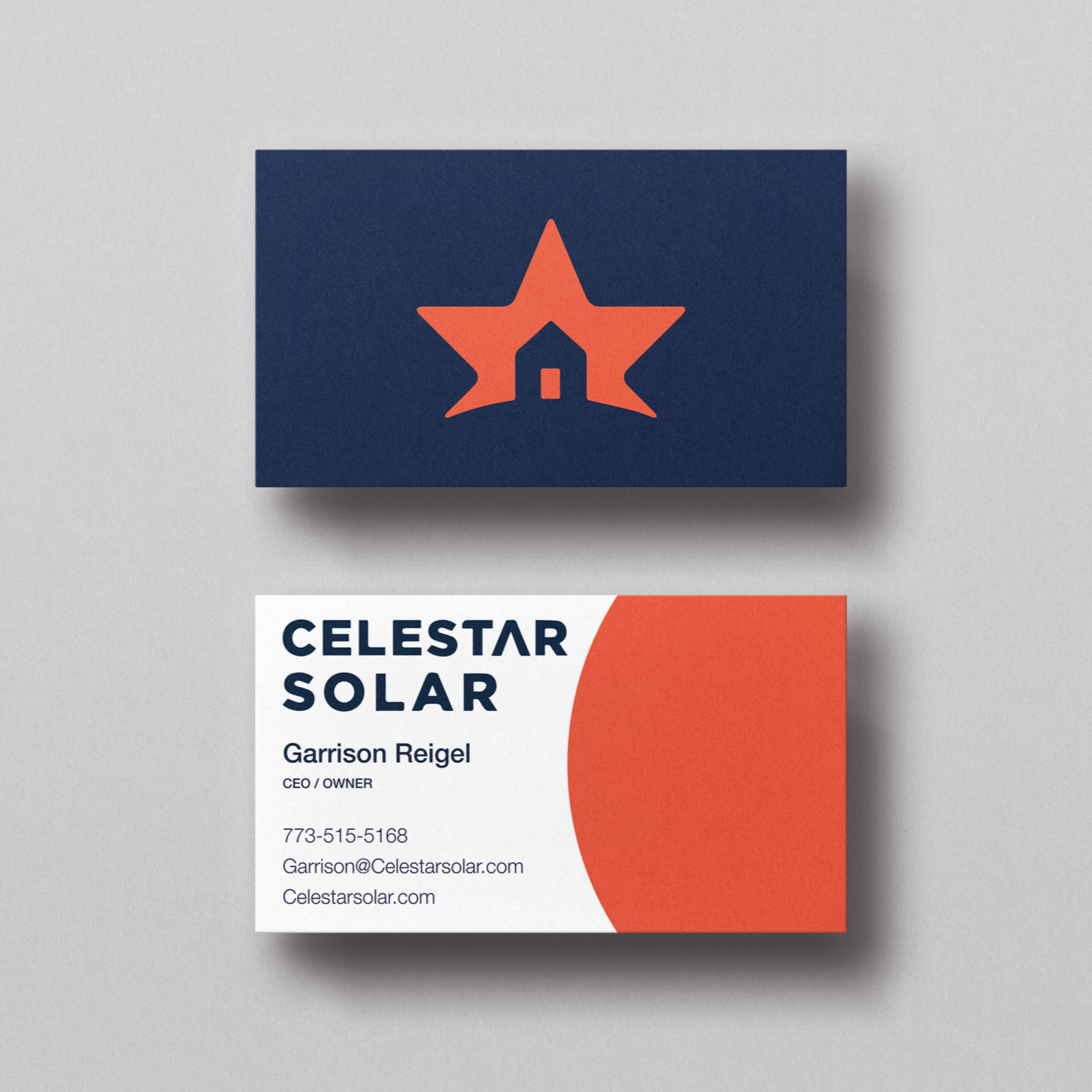
Design System
Using the previous assets of the client, we created a design system paired with a redesign of the company logo. The white text against the blue background allows for a trustworthy and stable representation, while the orange accent color adds energy and vibrancy to the brand. The goal of this design system is to simplify the process of creating the website and allowing for a clean, consistent layout across the pages.

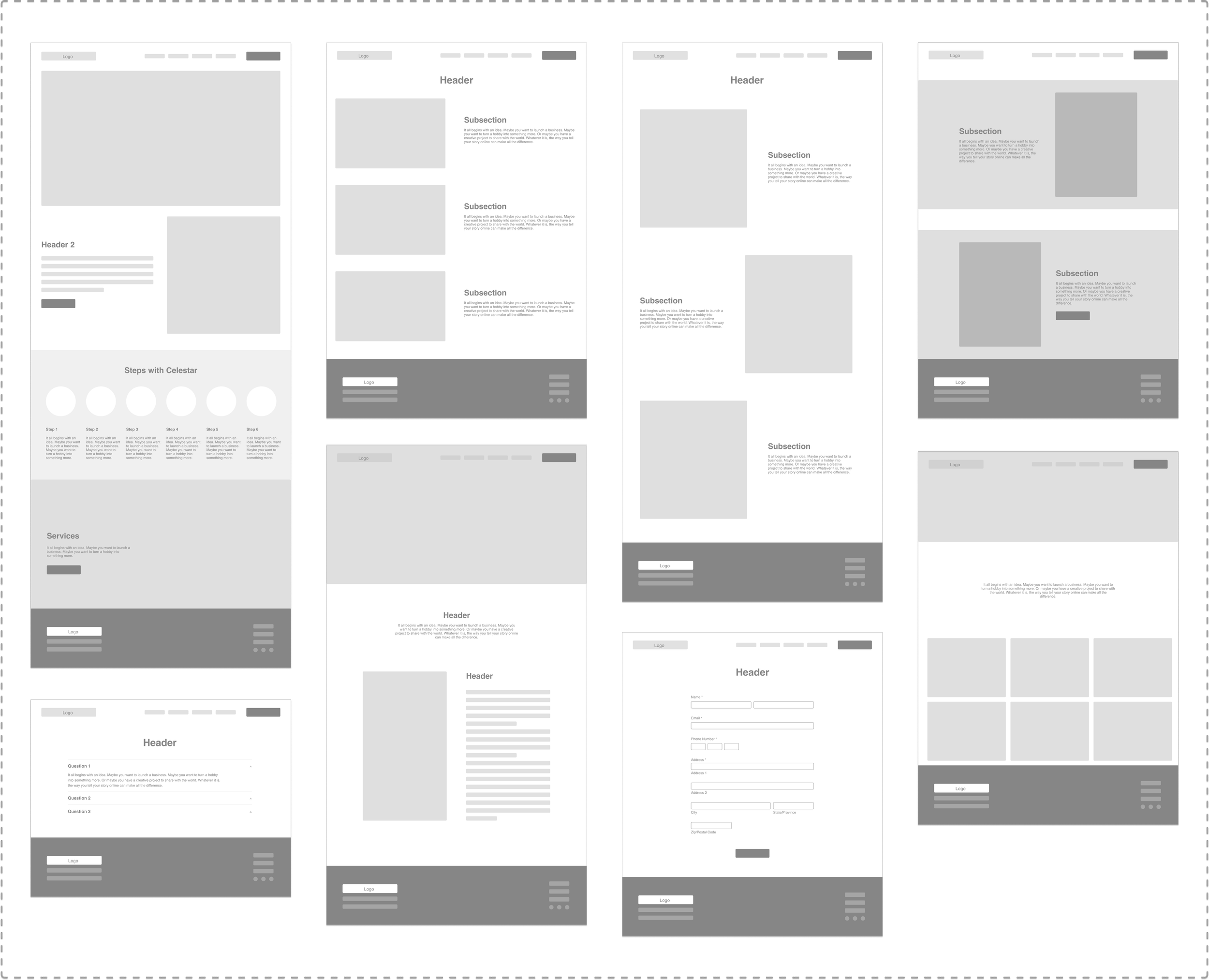
Mid-Fidelity Wireframes
Using our selected SquareSpace template as a reference, we redesigned the different sections of the website pages and then constructed mid-fidelity wireframes via Figma to fully layout the website design before digging deeper into the high-fidelity.
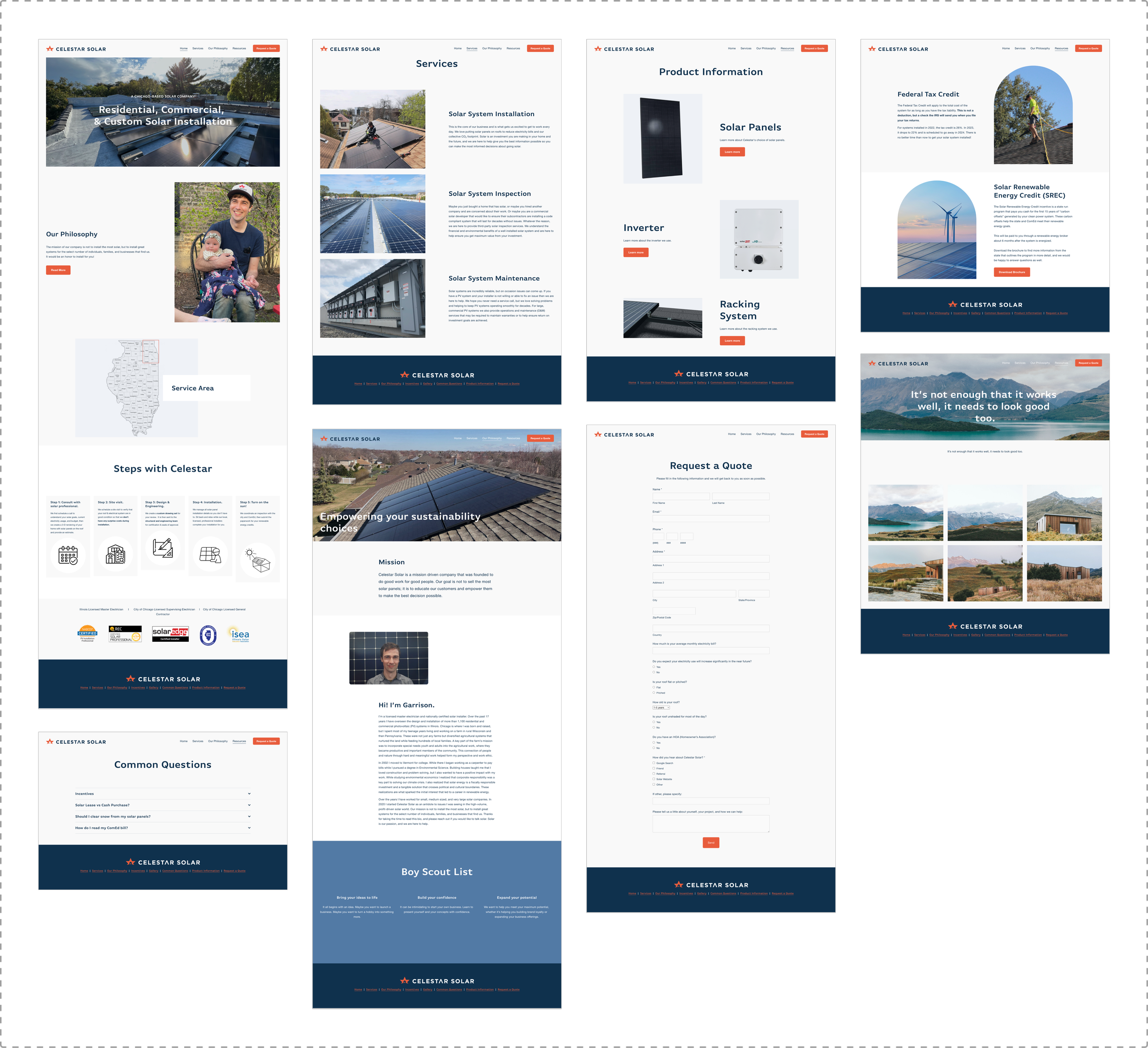
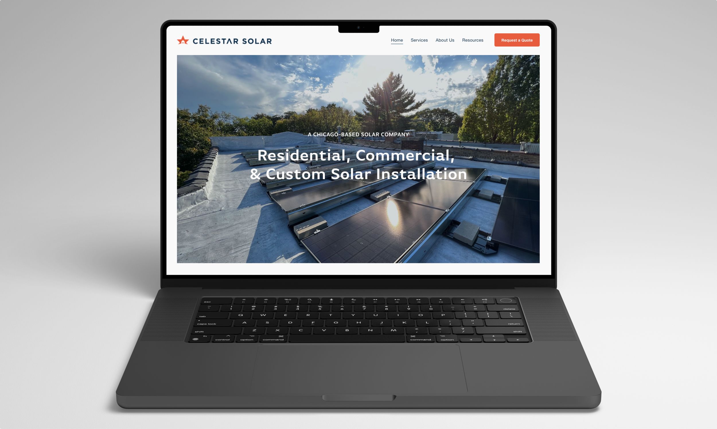
High-Fidelity Wireframes

Next Steps
For future iterations, I would love to work on the following:
Designing the reviews page to show the feedback provided by future customers.
Reviewing analytics to see what pages or links users are drawn towards.
Redesigning the blog section after client creates posts on his journeys.
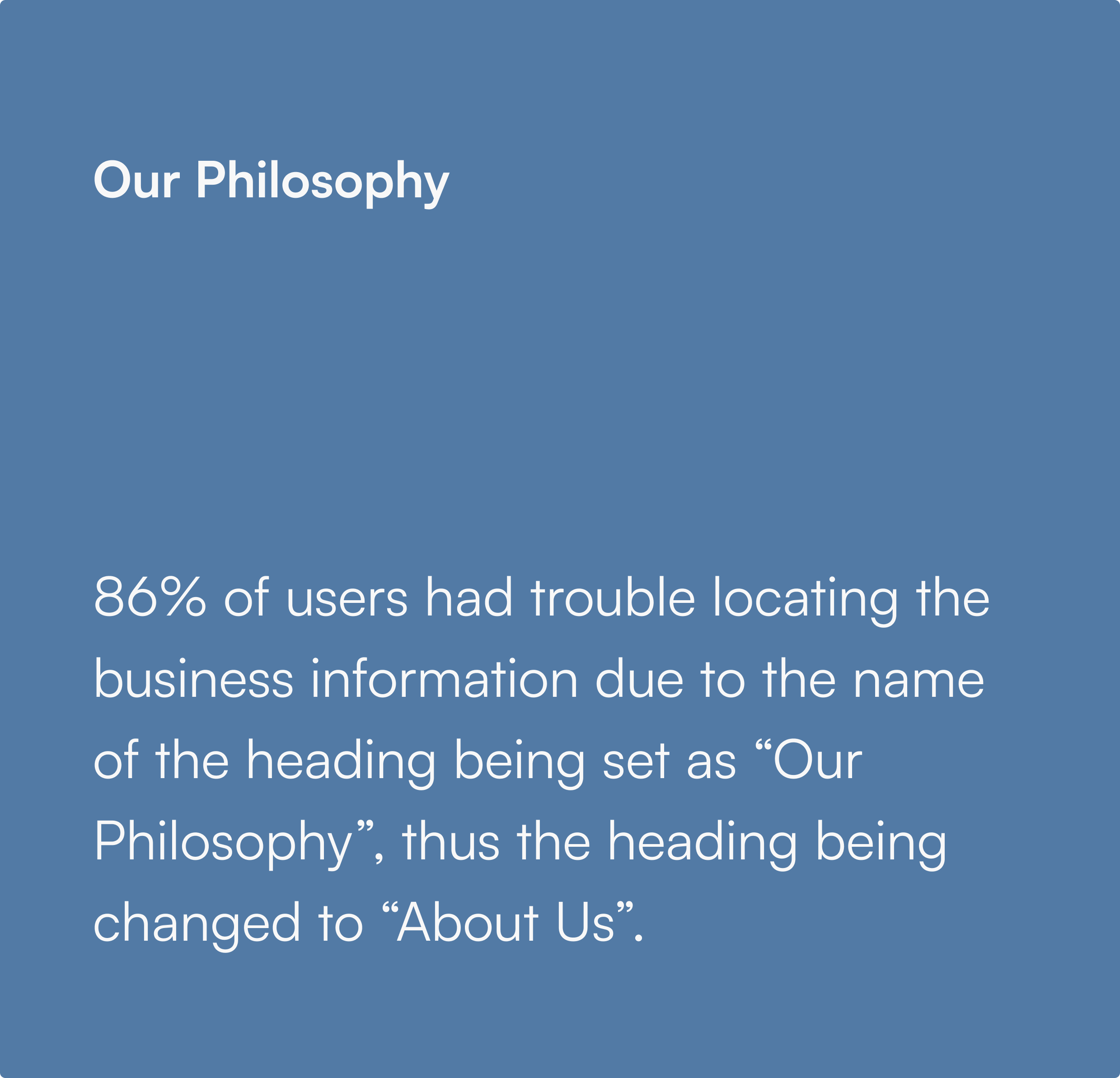
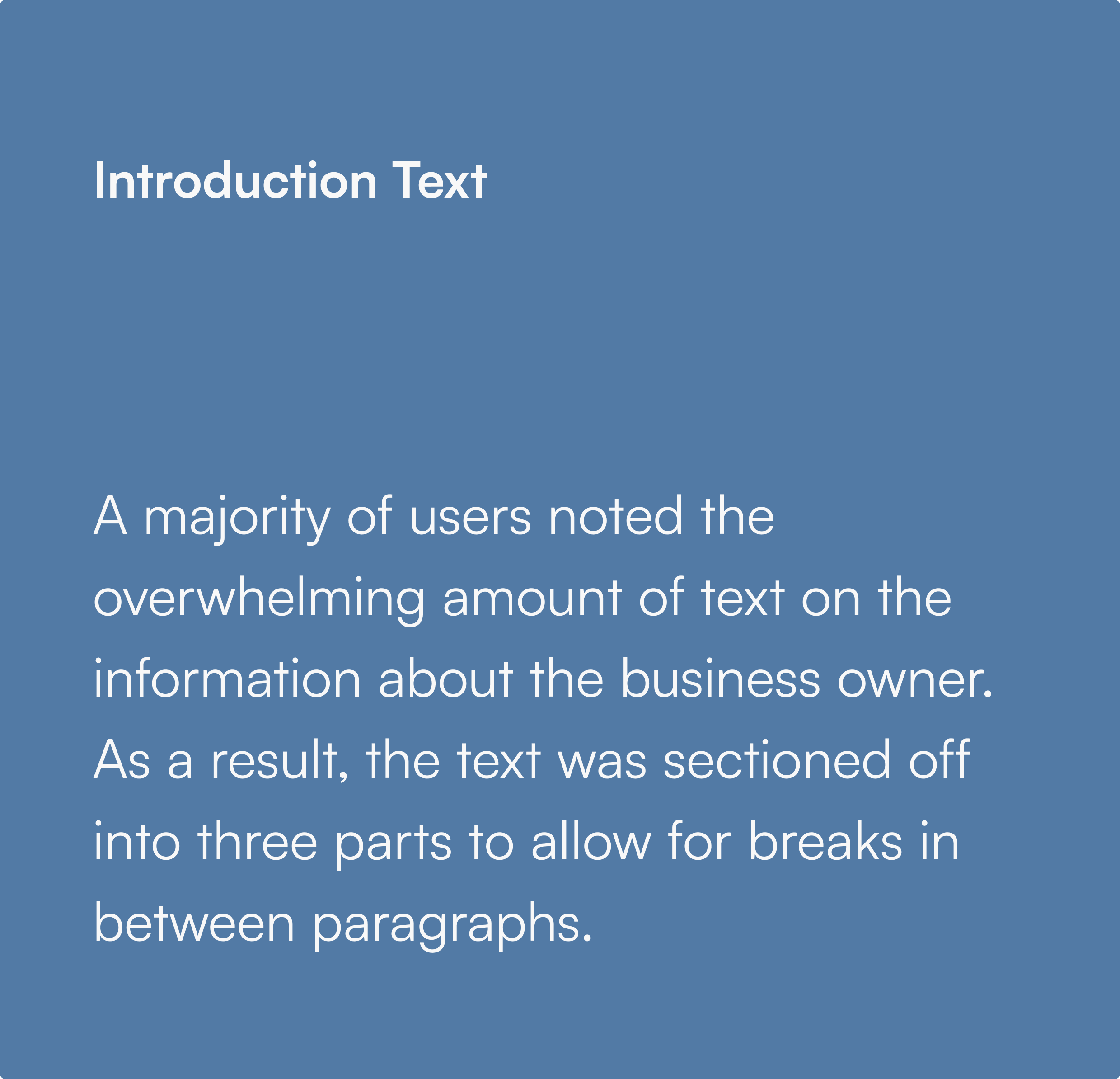
Usability Testing Results
Once the high-fidelity prototype was finalized, we wanted to observe whether users would be able to navigate through the website successfully and to hear their overall thoughts on the design. Through our key insights from the usability tests, we made the following iterations to improve the user experience:


Final Designs